Skip to content

Alexander Francis Blog
Furniture
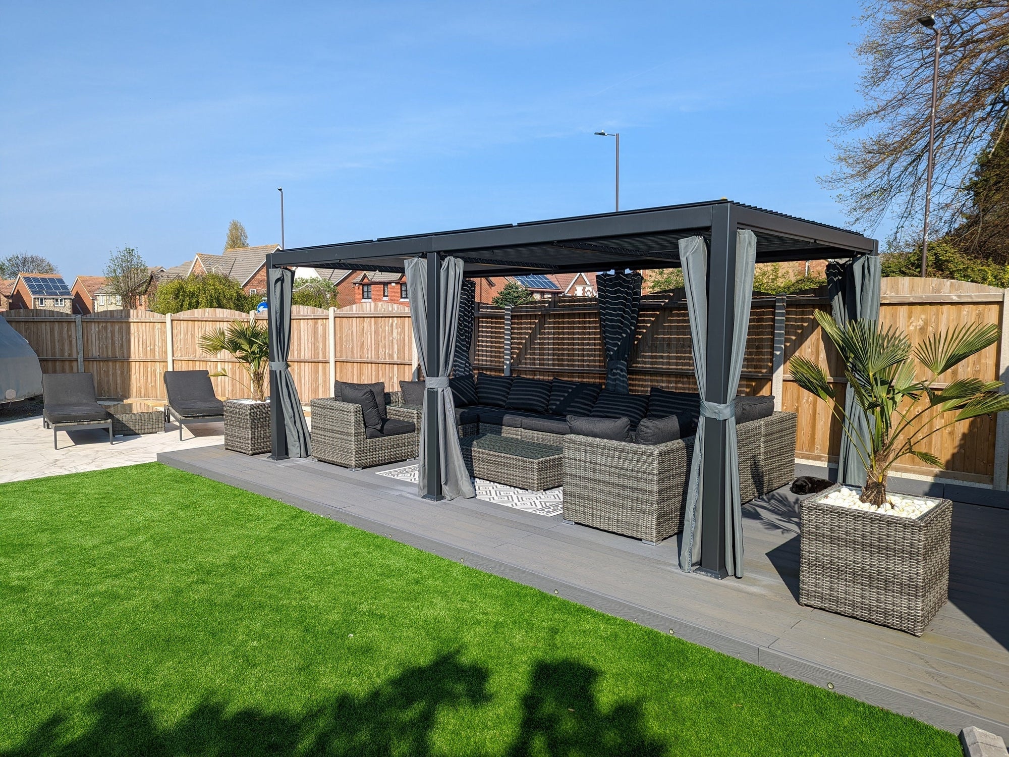
Should I choose metal or rattan garden furniture?
Choosing the best garden furniture can be tricky, so here are the pros and cons of rattan garden furniture and metal garden furniture to help you decide.
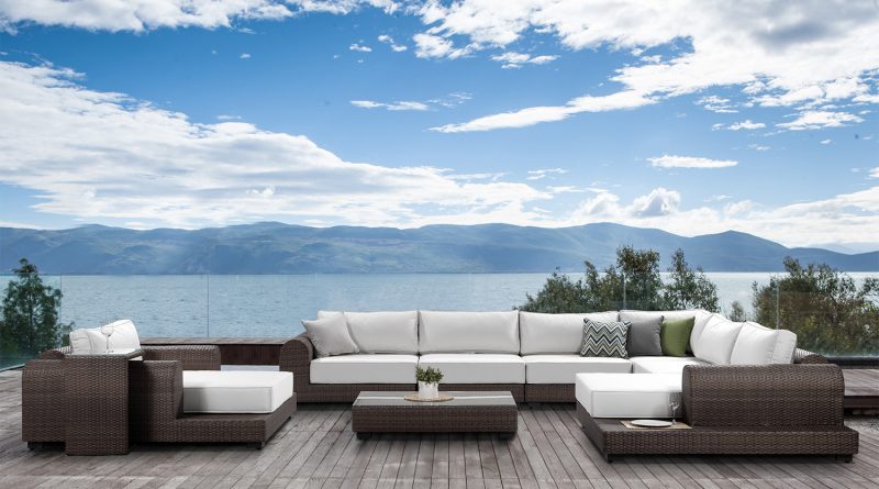
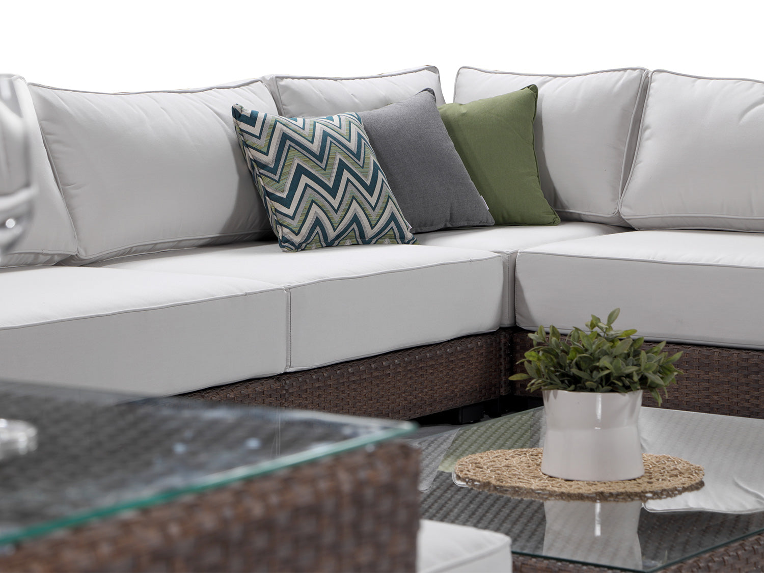
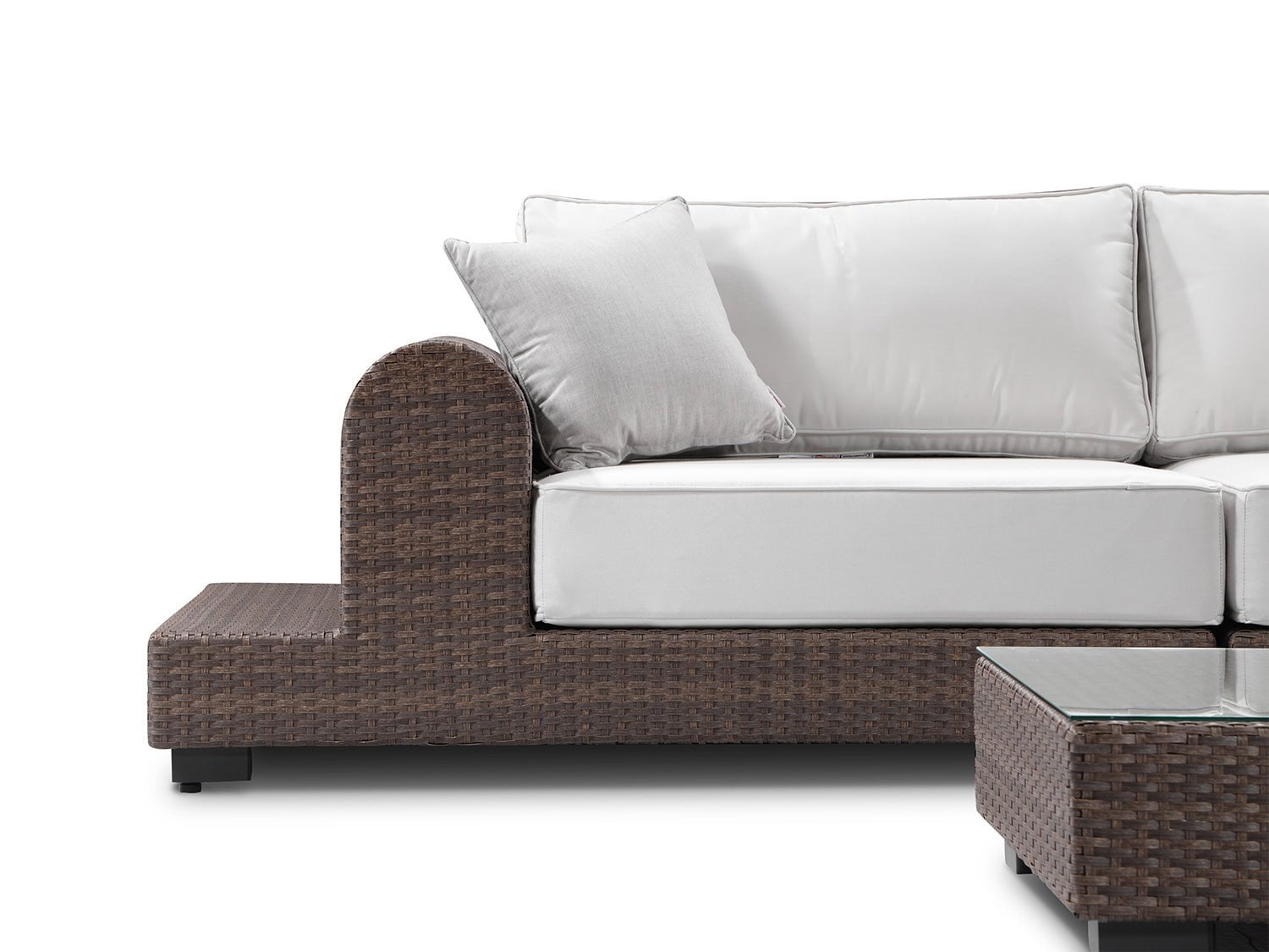
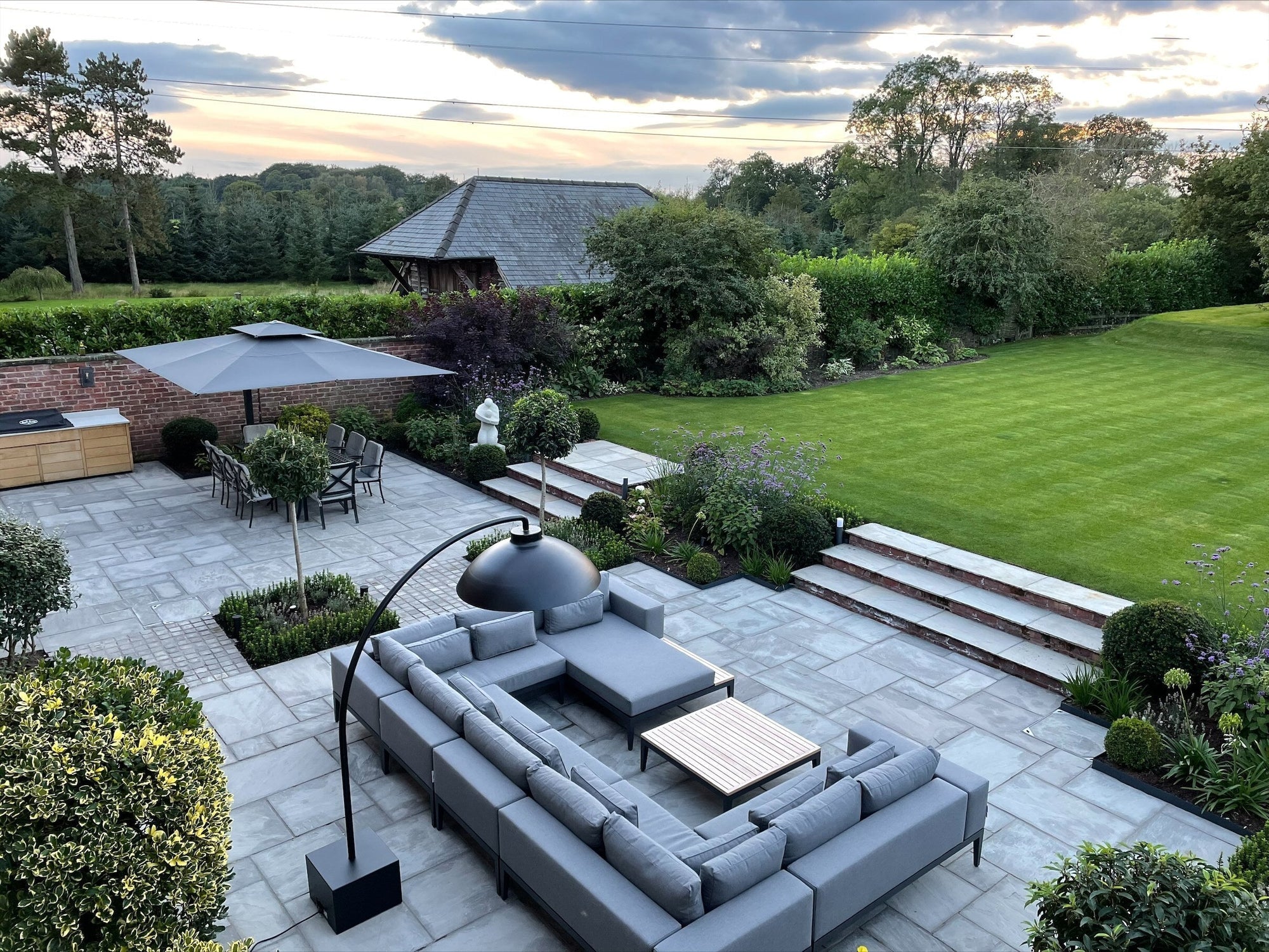
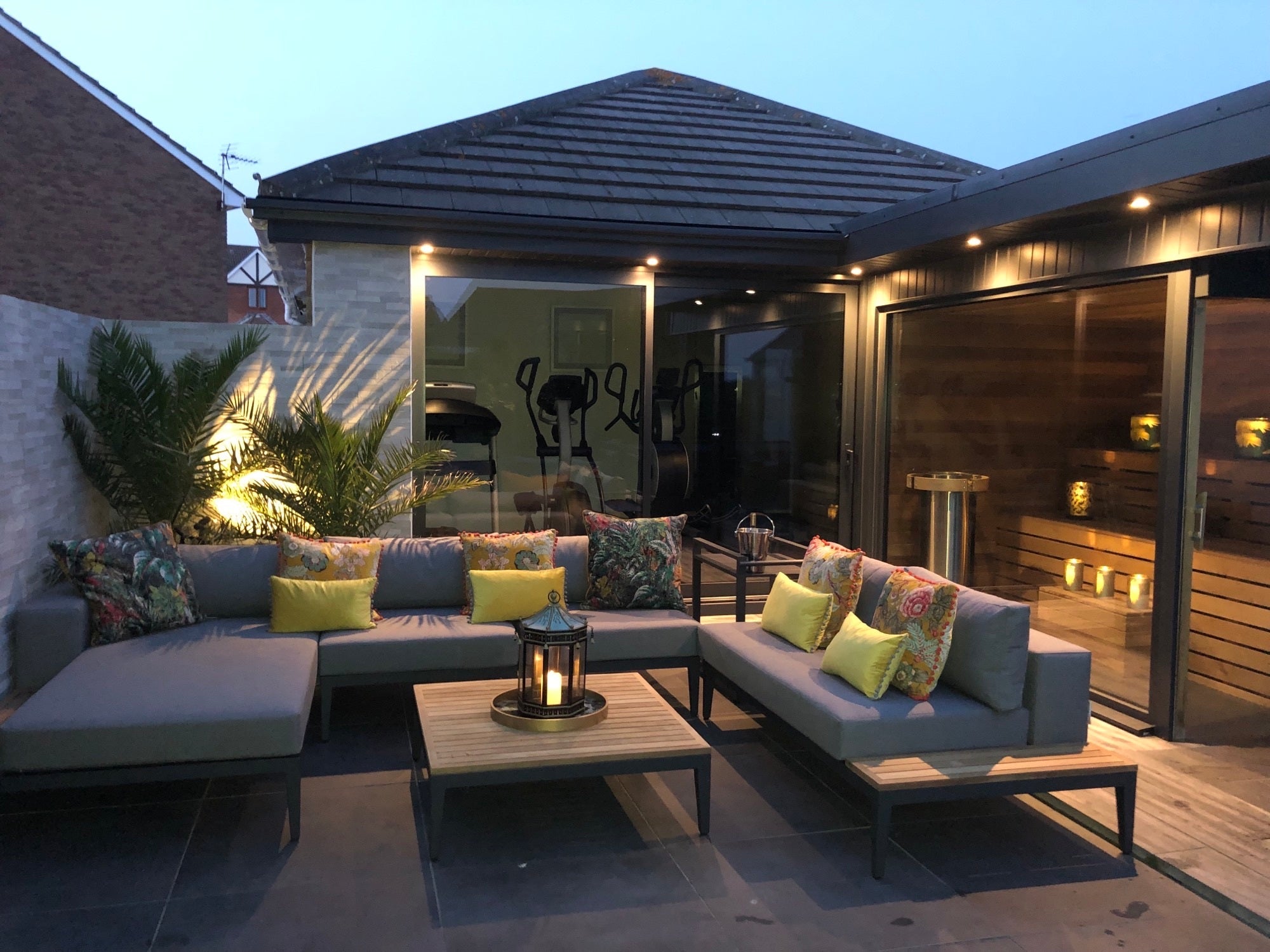
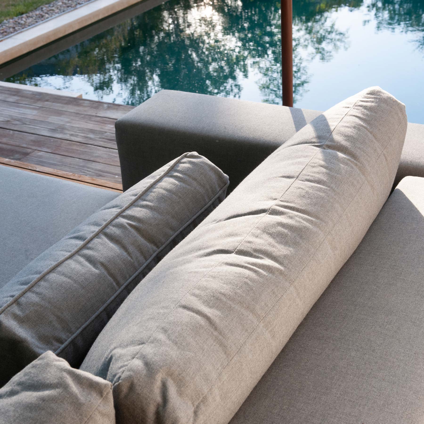
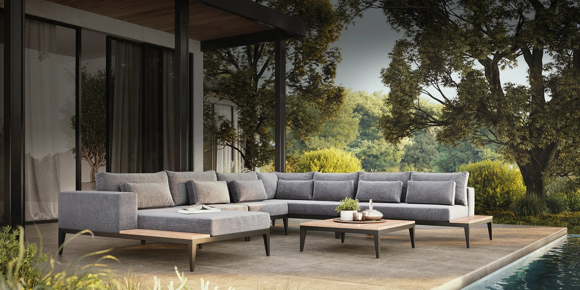
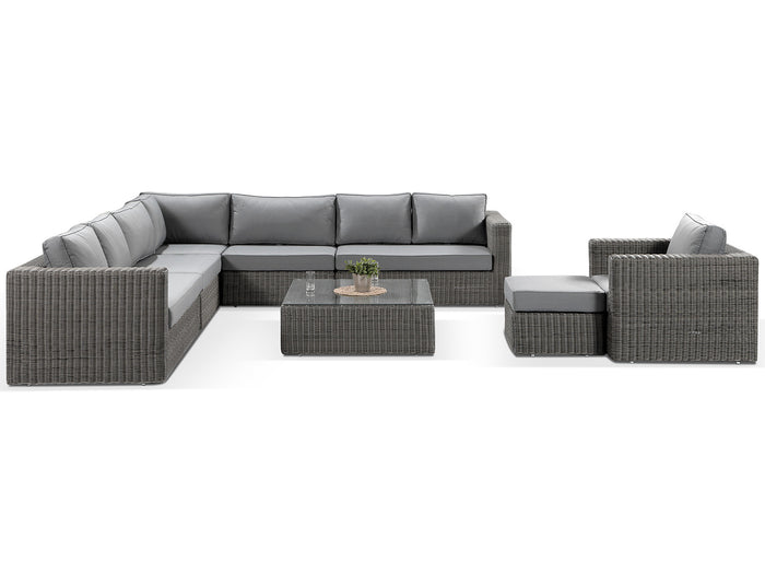
Corner Sofa
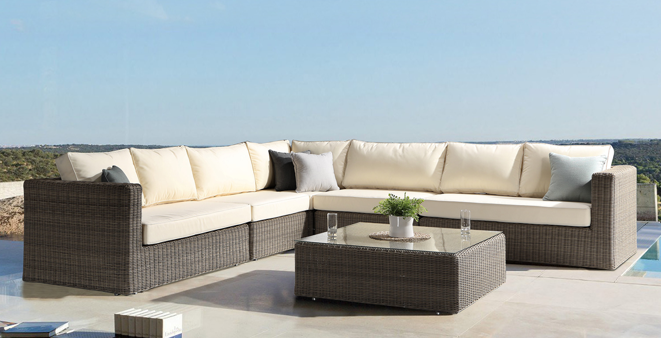
Sunbrella Fabric Sofa Set: Milano
Our Milano is one our classic pieces using Sunbrella Fabric has been with us for many years.
This classic design is elegant and timeless. With a beautiful natural feel brown rattan that will blend...
12 advantages of metal garden furniture
When choosing the perfect set for your outdoor space there are a few important aspects to take into consideration, durability, style and practicality are some of the key features to take into consi...
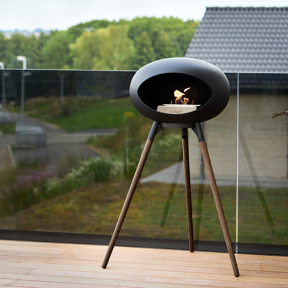
Le Feu Fireplaces: Where Elegance Meets Eco-Friendly Warmth
In the realm of interior design, fireplaces hold a special place. They not only provide warmth but also add a stylish touch that can elevate the look of your home. One brand that truly stands out i...
Furniture
Unwind and Indulge: Things to Do in Your Daybed This Summer
As the summer season comes in and the sun is shining and the temperatures soar, it is time to make the most of your outdoor space and relax and enjoy the blissfulness of the outdoors. There is no b...
Furniture
Can Fabric Furniture Be Left Outside?
Worried your garden furniture won't survive the outdoor elements!? Let us explain what fabrics you should be looking out for to give your sofa set the best life possible.
In short. Yes, but also po...
How to Clean your Sunbrella or Olefin Fabric Cushions
Sunbrella and Olefin fabrics are widely used in outdoor furniture upholstery due to their exceptional durability, resistance to fading, and easy maintenance. However, to keep these fabrics looking ...

Furniture
How to restore weathered wood furniture
high-end patio furniture. Whether it’s the warm glow of teak, the deep tones of mahogany, or the intricate texture of a rattan sofa set, these pieces are more than just functional. They’re an exten...
28 North-facing Garden Design Tips
Gardens are a haven for many of us—a place to unwind, entertain, and connect with nature. But did you know that the direction your garden faces can really shape its design and the plants that thri...
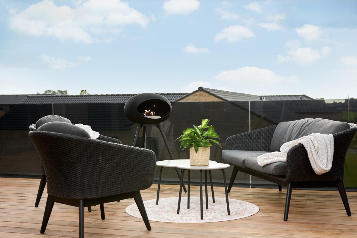
Why Bio-Ethanol Fire Pits are Better than Gas
Are you thinking about choosing a luxury bio-ethanol fire pit for your garden this summer? It’s a great idea, for making the most of outdoor areas for any occasion. But what type of fire pit should...
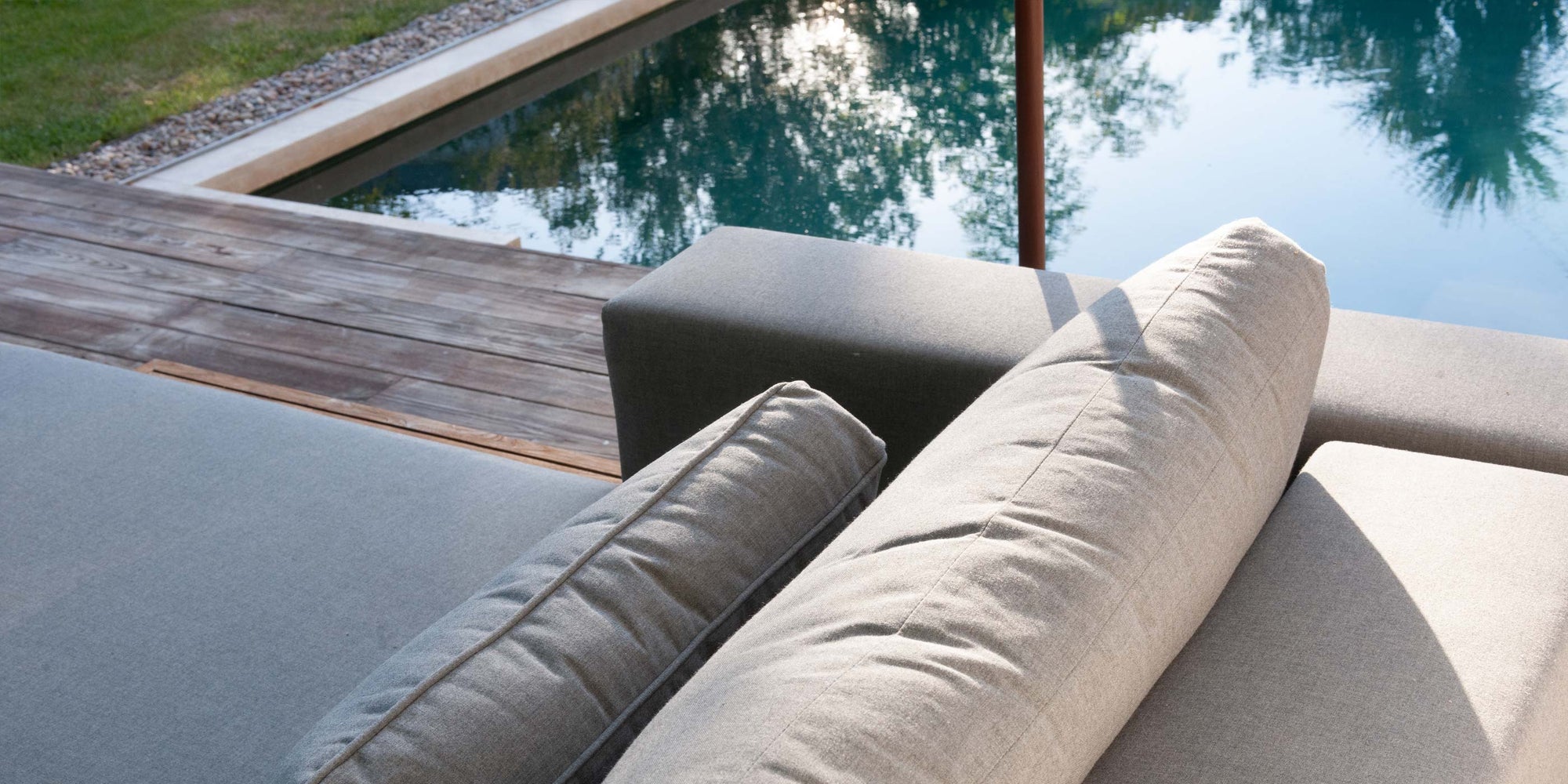
What Is Sunbrella, and Why Do I Need It?
Are you looking for the best material for your garden furniture? Look no further, as Sunbrella® fabric is the way to go.
Why Choose Sunbrella Fabric?
Durability: Sunbrella fabric is incredibly ...

Pantone Colour of the Year 2025
Mocha Mousse
Pantone colour of the year is created by The Pantone Colour Institute which is an educational program to create conversation in community around colour and design to bring attention ...
Outdoor
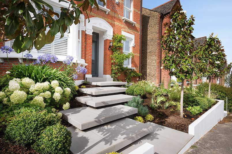
10 front garden ideas to increase kerb appeal
Whether you’re trying to sell your home or you just want to enhance your enjoyment of your living space, paying attention to your front garden’s kerb appeal is an extremely important part of the ho...

How do I stop my furniture from scratching my patio?
Your patio is the perfect place to relax, enjoy your garden and entertain guests, but without proper care and maintenance, it could potentially become an eyesore. Over time and rough usage, unsight...

Garden
How to make your garden more colourful
Is your garden currently bringing more frustration than enjoyment? It doesn’t have to be this way! In an ideal world, your garden would be the perfect place to relax on sunny days or entertain your...
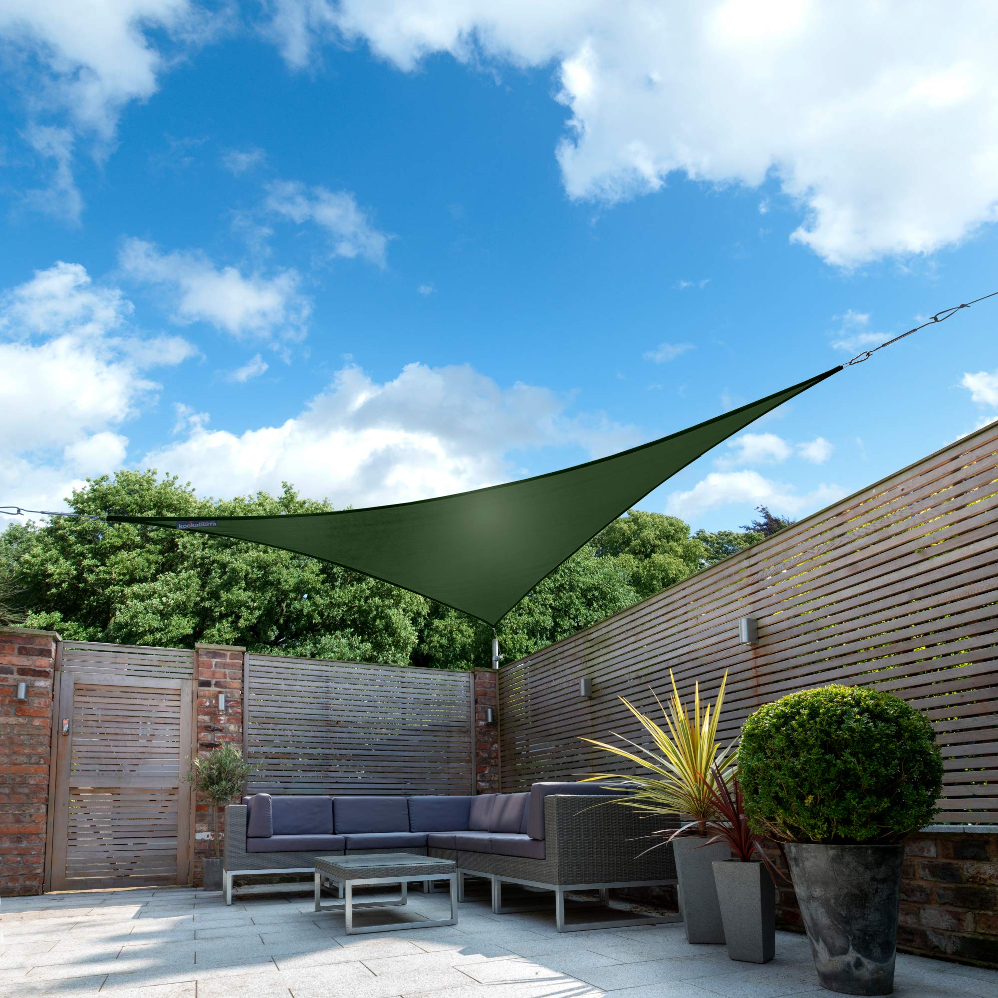
How to make shade in your garden: 12 garden shade ideas
We all love a bit of sunshine, but too much can start to become problematic. Not only is too much heat and sunlight uncomfortable for you and your guests during outdoor parties, gatherings and al f...
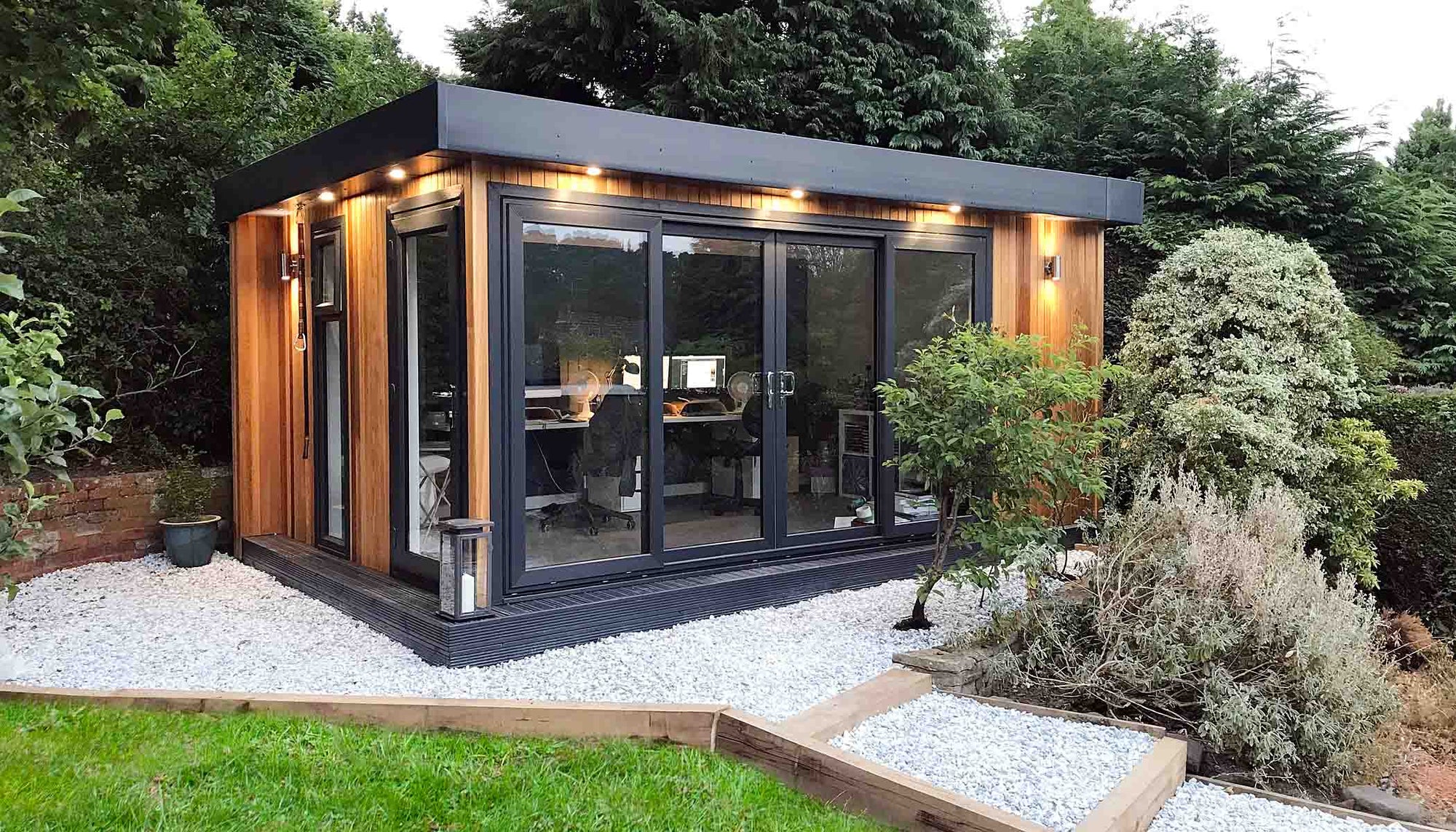
How to create a luxury garden room
Creating a luxury garden room is the perfect way to expand your living space, adding an indoor-outdoor retreat that combines elegance, functionality, and natural beauty within your garden. Whether ...

Garden
Caring For Your Garden This Winter!
With Summer over and winter drawing ever closer preparing your garden is of upmost importance to ensure it is ready for when spring rolls around! We here at Alexander Francis have put a few tips to...
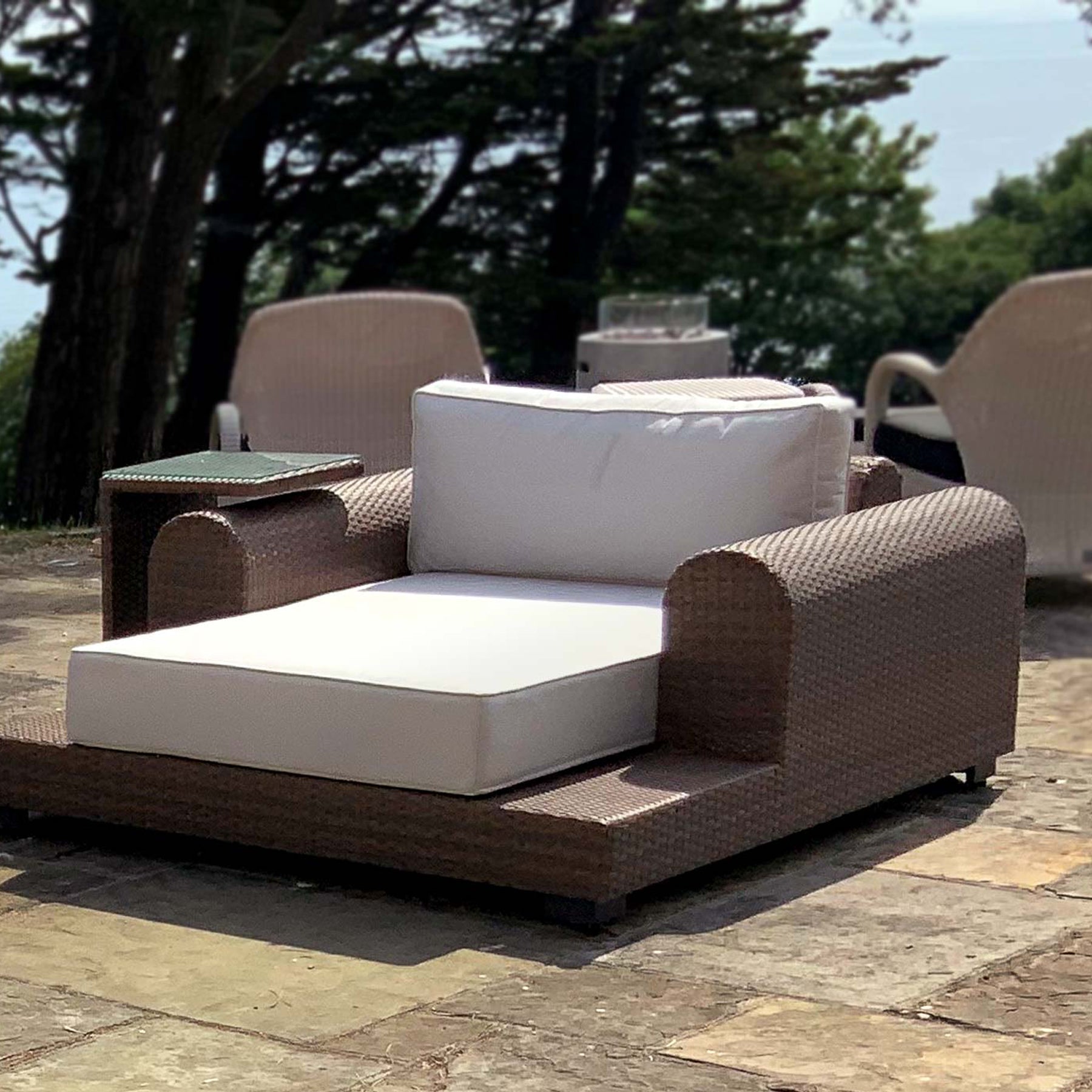
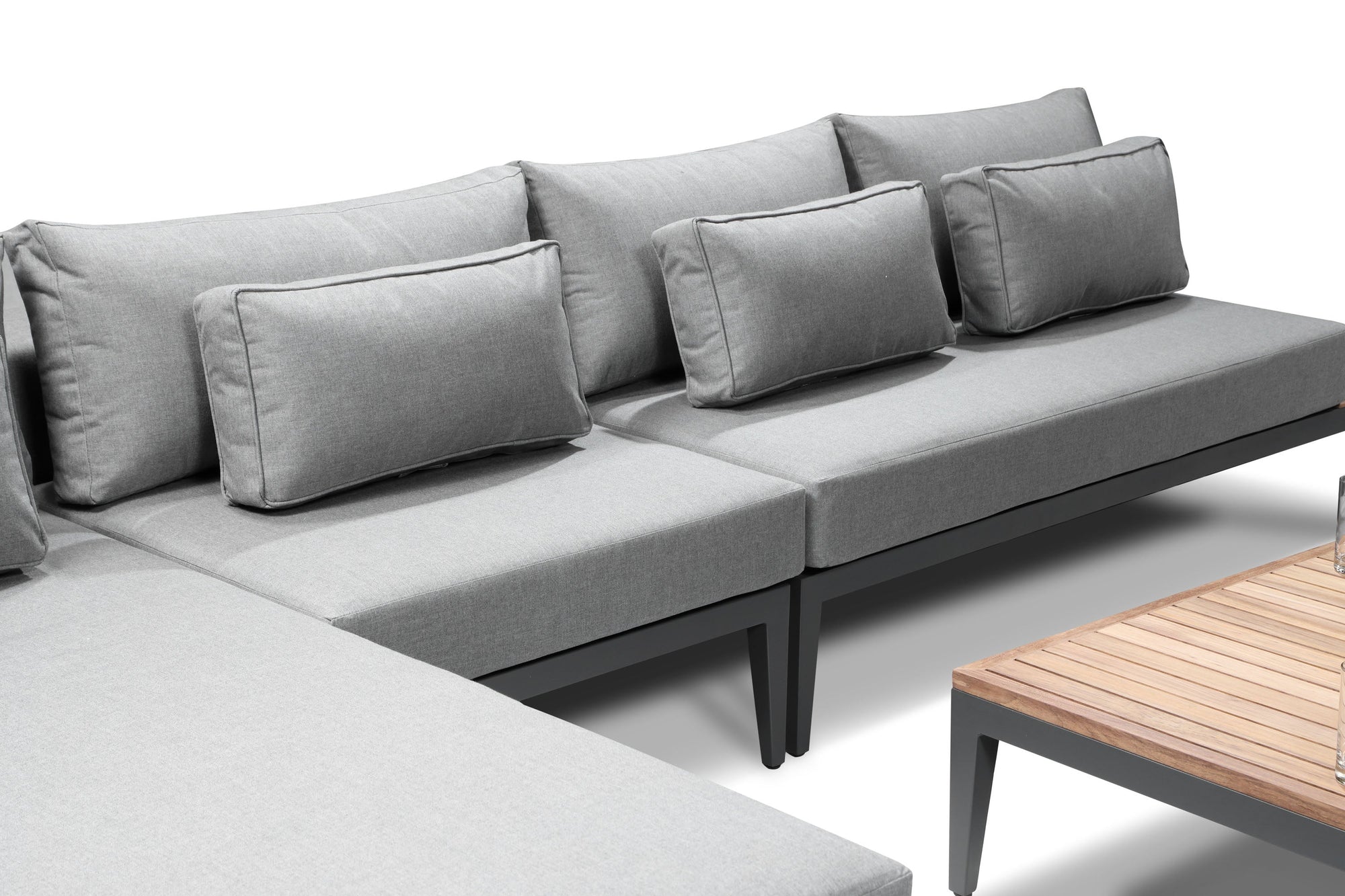
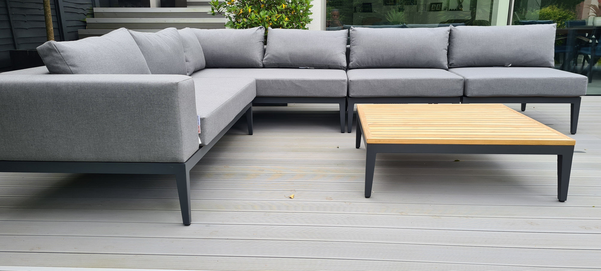
Advantages of Modular Furniture
With garden spaces modular furniture is the pinocle of versatility and practicality, allowing multiple options for arrangement and the perfect way to cater for your garden space with its functional...
Furniture
Garden Furniture Winter Care
With the winter now just round the corner and now being in the wetter seasons, it is essential that your furniture is protected ready for the sun next year! Some issues can occur if it is not prote...
24 garden privacy ideas
Creating a sense of privacy in your garden is essential for transforming your open, outdoor space into your very own personal sanctuary.
Whether you want to shield yourself from prying eyes or sim...
Furniture
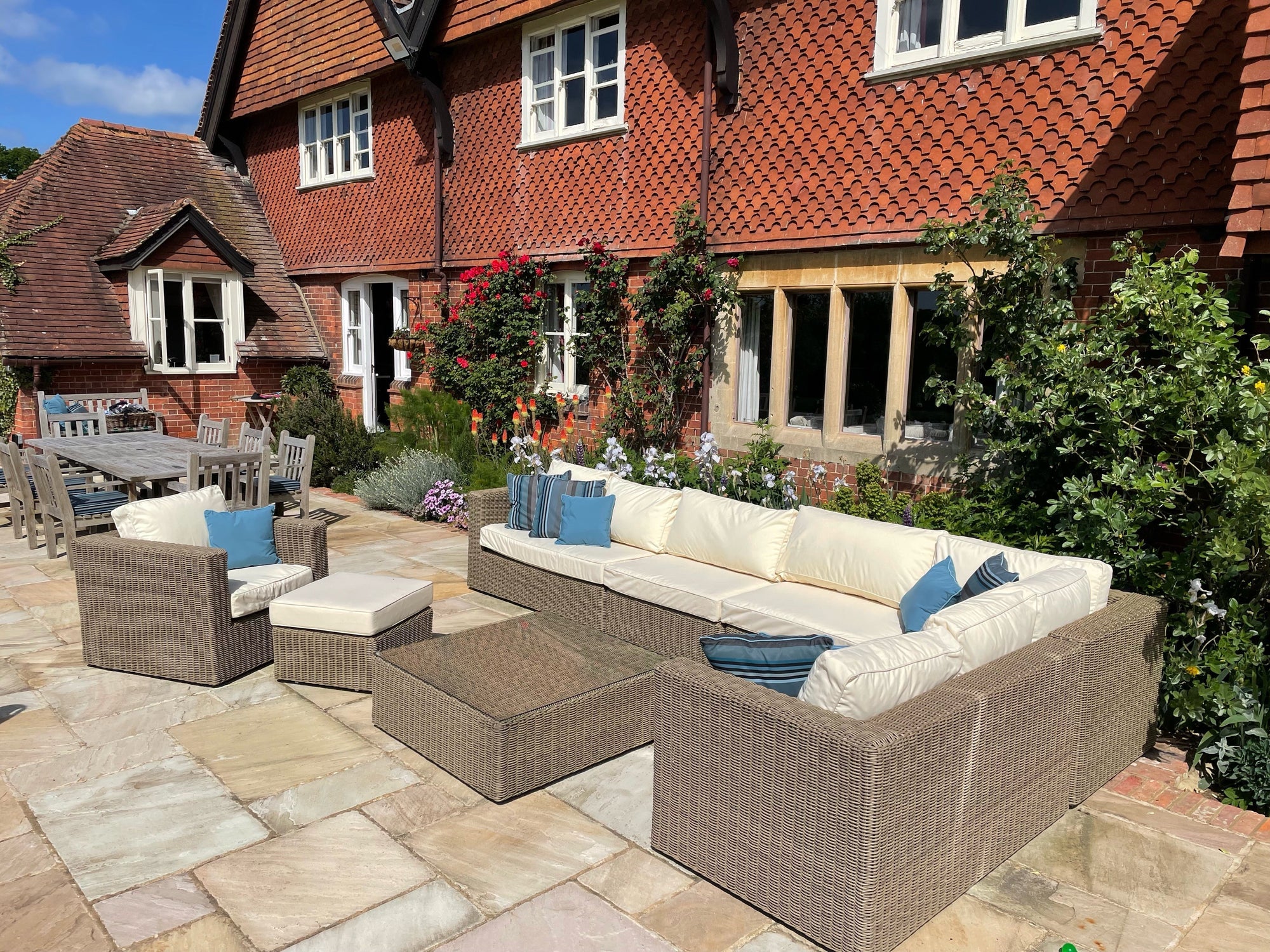
Traditional vs modern garden furniture
Garden furniture is an essential element in creating an inviting and functional outdoor living space. It not only provides comfort and seating, but also contributes to the overall aesthetic appeal ...
Garden
How to enjoy your garden all year round
Creating a garden you can enjoy year-round isn't just about planting for spring and summer - with a bit of thoughtful planning and the right design elements, your outdoor space can become a haven i...
Garden
How to look after rattan garden furniture
Rattan garden furniture brings a touch of luxury and elegance to any outdoor space, combining style with functionality, making it one of the best garden furniture to buy.
However, to ensure it rema...
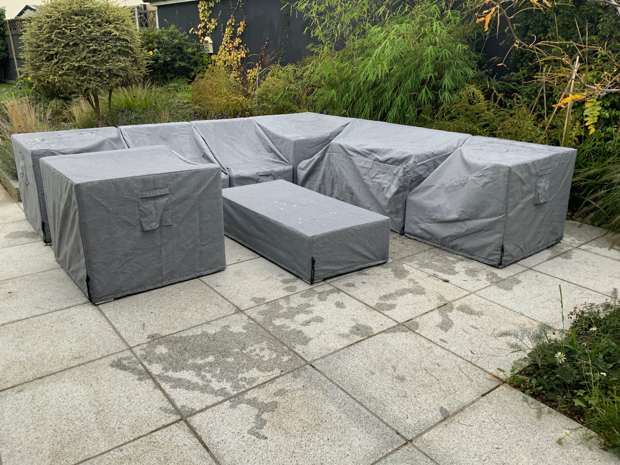
Why should you consider garden furniture covers?
The right garden furniture is essential for creating your ideal outdoor sanctuary, helping you break down the separation between indoor and outdoor living spaces. High-quality outdoor furniture can...
How to add privacy to your overlooked garden
Transform your garden into a secluded retreat with our garden screening ideas. Discover our easy steps to enjoy a more private outdoor space.

Garden
How to maximise your garden space
Maximising your garden space can be a game-changer, whether you have a large luxury garden or a compact urban plot. The key to achieving a lush, functional garden without it feeling overcrowded lie...
How to create a fire pit area
Hoping to get more use out of your garden? Whilst we all enjoy spending time outdoors on hot summer days, our gardens can be a bit neglected throughout the rest of the year. However, with a dedicat...
What is the best fabric for outdoor furniture? | Alexander Francis
When it comes to outdoor furniture, choosing the right fabric is super important to ensure it can withstand the elements whilst maintaining its beauty and comfort. Outdoor fabrics are designed to b...
Furniture
Winter Care Guide
Before the winter months sneak up on us. We wanted to lay out some clear and essential tips to keeping your garden furniture in pristine condition during its most testing seasonal period.
How Are ...
Furniture
Protecting Your Garden Furniture: Why It Matters
Protecting Your Garden Furniture: Why It Matters
Garden furniture is an integral part of our gardens, especially in the upcoming summer months, so making every effort to protect them matters. Not o...
Garden
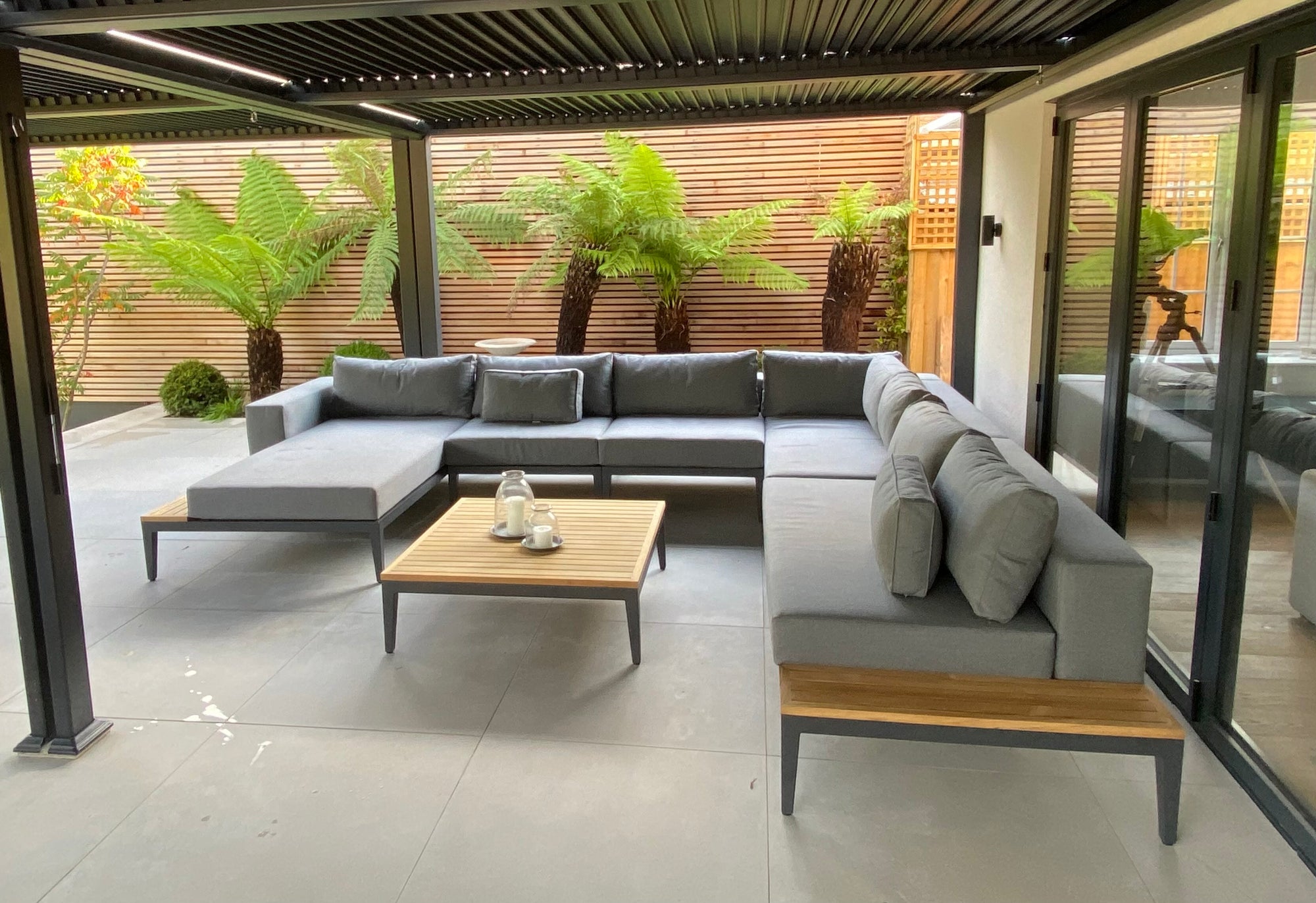
How to create a luxury garden space
Transform your outdoor space into a luxury garden. From defining distinct zones to selecting luxury garden furniture, explore our guide today!
Furniture
How to clean garden furniture
As the warmer seasons approach, you’ll want to make your garden look good for summer. Whether you’re expecting a summer of parties, barbeques, dining al fresco, or spending time with family, you’ll...
Garden
How to create a low-maintenance garden
With the summer season approaching, you’ll be wanting to spend as much time in your garden as possible. Whether you’re planning on dining al fresco with friends or lounging around with your partner...

Furniture
Elevate Your Easter | Making the Most Of Your Outdoor Space
Enjoy Easter In Your Outdoor Space
As Easter approaches, it's the perfect time to breathe new life into your outdoor space and embrace the joys of spring. With longer days and warmer weather on the...
Garden
Popular Garden Themes of 2023 | Alexander Francis
Your garden is a canvas of limitless possibilities, offering you the opportunity to transform it into a personal sanctuary that reflects your style and personality. By embracing thematic elements, ...
Corner Sofa
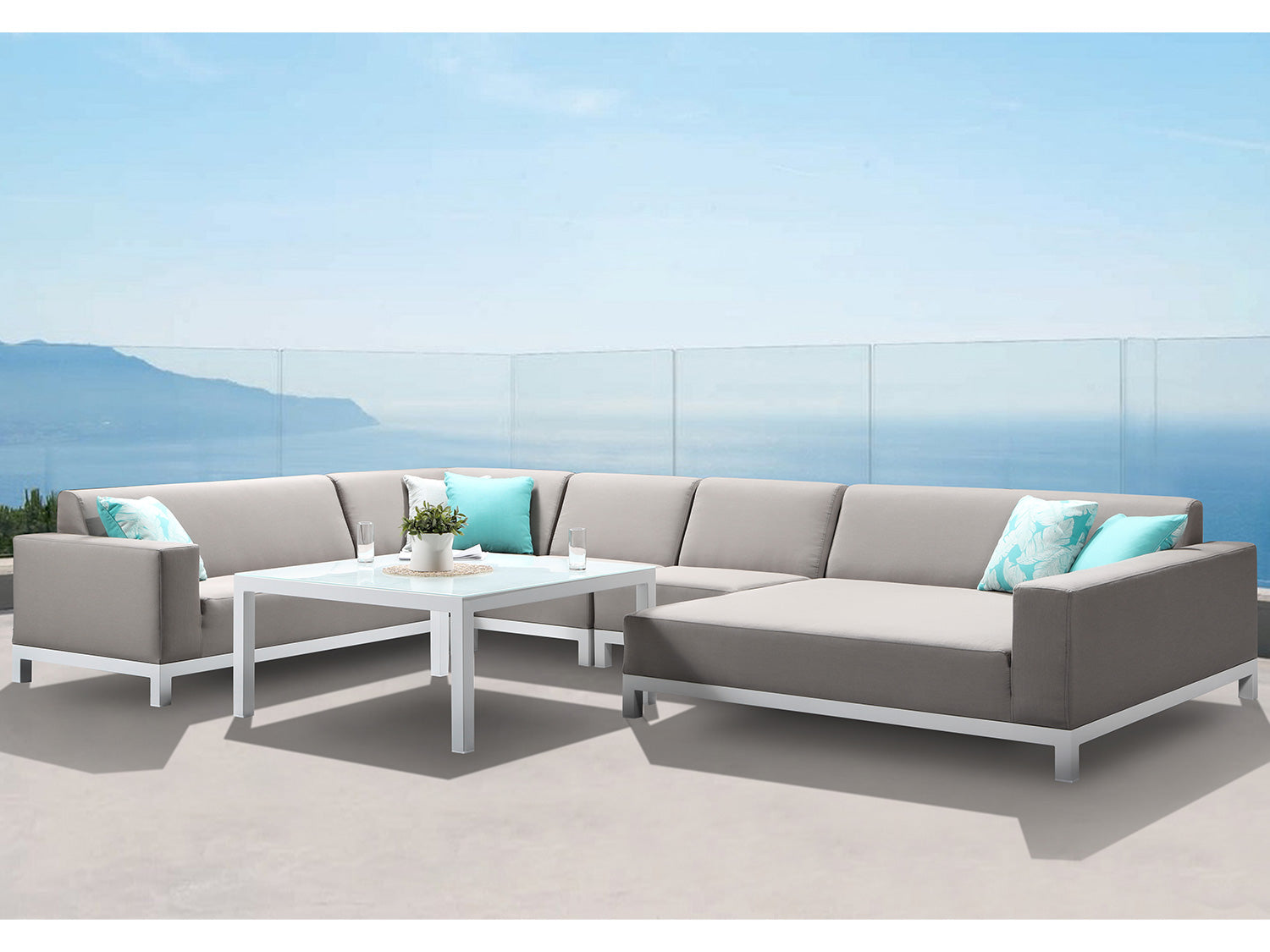
Sofa Sets Shapes Explained | Alexander Francis
When it comes to creating a cosy and inviting outdoor living space, the right sofa set can make all the difference. Gone are the days when outdoor furniture was limited to simple chairs and tables....

Rattan
How to Identify Rattan Furniture: A Beginner's Guide by Alexander Francis
As the summer season approaches, many of us are eager to spruce up our outdoor spaces and enjoy the warm weather. Rattan furniture is a popular choice, known for its durability, timeless charm, and...
Furniture
What Garden Furniture Can You Leave Out All Year?
As the warm embrace of spring gives way to the scorching heat of summer and eventually transitions into the crisp coolness of autumn, our gardens become an extension of our living space. When it co...
Rattan
7 Tips for Buying Rattan Garden Furniture
When it comes to creating a stylish and comfortable outdoor space, rattan garden furniture is an excellent choice. Rattan is a versatile and durable material that adds a touch of elegance to any ga...
Garden
10 Delightful Garden Activities for a Memorable Summer
As summer casts its warm glow upon us, it's the perfect time to revel in the beauty of nature and create lasting memories in our gardens. Whether you have a sprawling backyard or a cosy balcony, th...

Furniture
The Benefits of PE Rattan Garden Furniture: Why It's the Perfect Choice
If you are looking for the perfect garden furniture for your outdoor space, then rattan furniture might be just what you need. Rattan furniture has become increasingly popular in recent years, and ...
Furniture
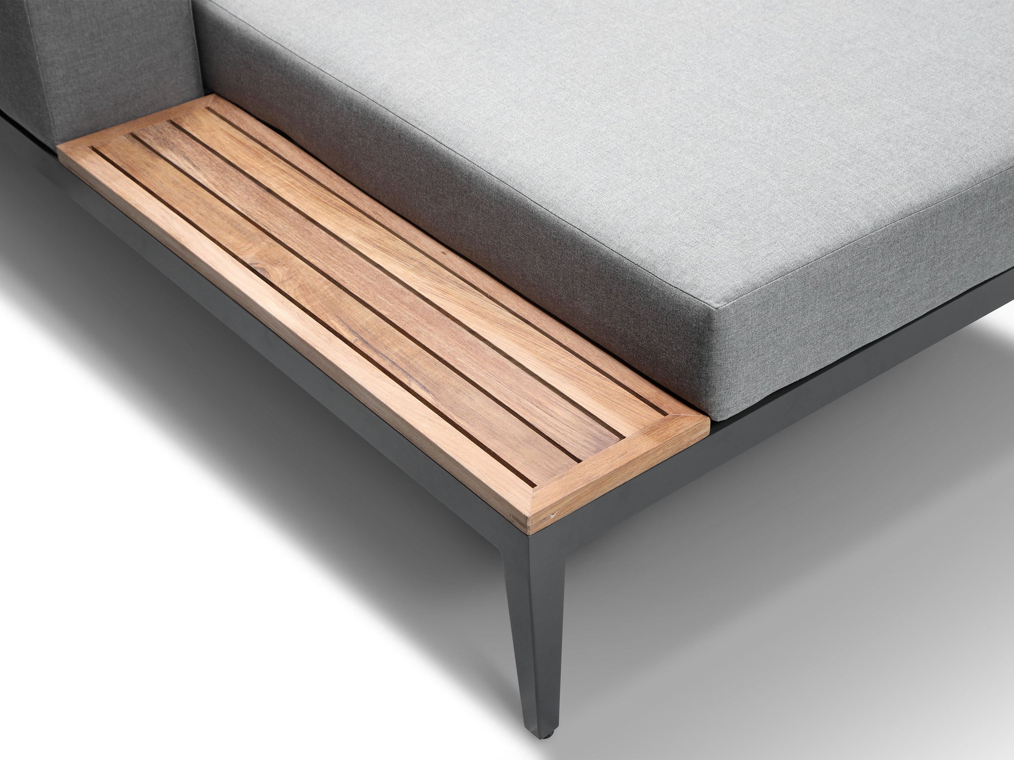
What Makes Teak Wood Furniture Special?
If you've browsed for outdoor garden furniture before, you've probably comes across Teak wood at some point, quickly followed by the price tag. Here's why it charges a high end price...
What Makes...
Furniture
Luxurious Rattan Outdoor Furniture for your Garden
Rattan furniture has become increasingly popular in recent years, and for good reason. It offers a timeless, classic look that can complement any garden or outdoor space, while also being durable a...
Corner Sofa
Choosing The Right Rattan Furniture For Your Garden
Choosing the right Rattan Garden Furniture can be difficult, there is so much out there and the difference in price and quality varies massively!
That's why we, at Alexander Francis, have done the ...
Furniture
The Minimo Collection of Luxury Furniture from Alexander Francis: Modern and Luxurious Outdoor Furniture
When it comes to outdoor furniture, there is no shortage of options available on the market. However, finding outdoor furniture that is both modern and luxurious can be a challenge. That's where th...
Outdoor
Prepare Your Garden For Summer In Spring
It can be all too easy to sit and let Spring pass us by in anticipation of Summer, however this is the perfect time to set up your outdoor oasis so when those hot days arrive you're all set. Here a...
Garden
How Covid Made Us Love Our Gardens Again
“Gardens are not made by singing ‘Oh, how beautiful,’ and sitting in the shade.” - Rudyard Kipling
Whilst it's something we took for granted beforehand, it became very apparent that having a ...